I visited the Architecture and Design galleries at MoMA this week, and was drawn to A.G. Fronzoni’s work. The museum had several examples of his work on view, all black and white lithographs. This poster in particular – created to advertise a cultural program called “Arte e Città” in Genoa, Italy – stood out to me.
It is arresting in its boldness and simplicity. The majority of the poster is taken up by a dynamic black double-headed arrow, which literally points to the small line of text at the top. The arrow’s sharp angles relate well to the dimensions of the poster. The way they extend almost to the edges of the page create a tension between positive and negative space.
To me, it is successful as an advertisement because it catches the viewer’s attention, but its message is not immediately clear. It is graphically striking and memorable enough to make you curious, and want to look closer to see what information is being advertised.
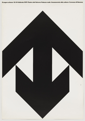
According to MoMA’s notes on the work, the designer was inspired by the flatness of Japanese art. It was interesting to see the influence carry on through 20th century design. 

A beautiful and powerful poster Tamar.
The big thing here, almost the only thing because of what you point out as the arresting simplicity, is the relationship between the arrowheads. They hold the same thickness (a relation of size and potentially depth) but the top one extends further out to seem bigger. A double headed arrow in itself is a conflict of forces, but it holds together as one until, one element or metaphorical character even if it pushes or directs both up and down. But with the extension of the top arrow (and the bottom tips of that bottom arrow) you have an amazing conflict between the two directions that is both in balance as one unit and actively separating in planer space.