This is an annual event worth going to. Wander around PS1 and see some interesting things. This weekend only.
This is an annual event worth going to. Wander around PS1 and see some interesting things. This weekend only.

My $0.02 on Herbert Bayer’s Things to Come (1938) print, currently being shown at the MoMA. (Posted on 09/08/2013 https://thistothen.wordpress.com/wp-admin/post.php?post=456&action=edit&message=6&postpost=v2)
What I discovered while looking at this design was the relationship between the world and the mind, which are linked through the body. My takeaways from this design were that the body links things and thinking through doing (affecting things in the world and our relationship to them). Including perception, bringing information from the world to our thinking.
I thought this was great because it there is a clear connection between the mind, body and world in this design on both an internal (mental) and external (environment) level. I also was drawn in to the aesthetic design element where he mixed hand sketching with bold background and thin detailed lines. Small but powerful piece!


I went to the MoMA and came across this Poster by Le Corbusier (Charles-Edouard Jeanneret). I had never heard of Le Corbusier before as I am not familiar with architecture. His work was hanging in the Design & Architecture exhibit, which featured many more of his creations. The image stood out to me because of the different colors and textures. On further inspection, you are able to tell that they are all of different mediums – Photostat (photocopy), drawing, and painting. The use of organic shapes refer to the architects paintings – this poster is for the first large scale exhibition of his work, specifically fine artistry. Even though the poster is directly related to a fine art exhibition, it clearly depicts the architect’s interest in the arts. His use of handmade text and layout is what stood out to me most. The abstraction in the Photostats was really interesting – I still cannot fully tell what they are of. They look like pencil drawings to me. The form and color – choosing primary colors, also stood out. I am not familiar with his paintings, but maybe this his style. Overall, the conjunction of all these mediums, colors and shapes gives the idea of a collage, rather than a flat handmade image. This is what made the image strong because it provided a lot of depth. Everytime I inspect it further, I am intrigued. I wonder how he did and why he chose the shapes and Photostats that he did. I am a big fan of handwriting, and it seems that this is his. I think that was a very strong use of text as it is for a personal exhibition, and it clearly depicts his personality.
Baylee Shurman


The large image in the center of this poster is a plan of the park it is celebrating. I find this a very interesting way to draw a plan, using simple blocks of bright colour and pattern. On first look, one might not even realize that they are looking at a plan of the space, but rather a colourful abstract pattern/composition. I am also very fond of the beautiful typography in the upper left corner, which is all of the additional information needed to communicate the purpose of this poster/print. I love the contrast of the simple and spacious typography to the bold and rich focal point of the poster. I also really admire the justified text, all caps with plenty of tracking and leading. I think the deliciously light typography is my favorite part. Additionally, since I have done some drawing of architectural plans (simplified for clients) I really love the idea of showing the spaces in such a nontraditional way.
This poster is currently on display in MoMa and I find it very appealing because the poster is emphasizing a message to the audience. It is a propaganda and I can see the artist wants to show how strong the voting was in that political period.
I discovered that the artist worked with shapes and collage in the poster. By overlapping with hands, it makes it graphically interesting. The big hand on the top, having the palm facing the audience is a representation of the voice from the public. The poster is unique because the images are positioned at one angle which creates a strong impression to the audience. The use or red-orange gradient on the background is bright which helps bring the image to its focal point. The scale of the graphics are small at the bottom but enlarges to its maximum on top of the page. I think the poster is powerful which serves as a socialist propaganda.
Sandy Shee


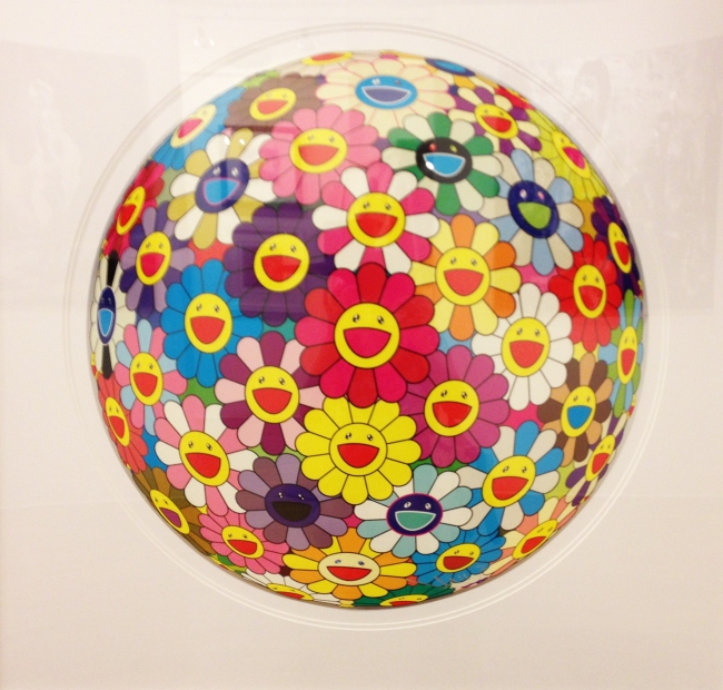

I was walking through Soho and I spotted a few Murakami pieces being sold in a gallery, most notably “Flower Globe.” Even if I wasn’t familiar with this artist, I think I would have been drawn in by the bright colors and cute shapes. The design looks like it’s painted onto a sphere protruding from inside the frame, but I assure you, it’s flat! Murakami uses perspective to great effect to make “Flower Globe” appear three-dimensional (there are also sculptural versions in 3-D.) This is interesting, especially since Murakami is the founder of the “Superflat” postmodern art movement, which emphasizes a lack of dimension.
I think that the colors are one of the most interesting aspects of this piece. As I mentioned before, they are eyecatching—but also somewhat displeasing, because they’re all so bold and bright and don’t follow any discernible scheme. The flowers are colored seemingly at random, without adhering to a pattern. Some of the flowers’ colors seem to be inverted, with white or red outlines and black or blue faces. Combined with the maniacally happy expression of the flowers, the effect is unsettling, but this cute/creepy combo is a mainstay of Murakami’s work.
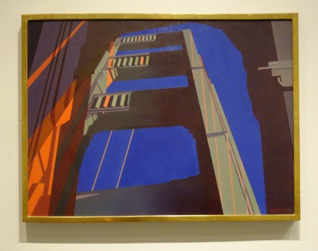

I went to the Metropolitan Art Museum and this painting by Charles Sheeler caught my attention. The great contrast between the high chroma and low chroma colors, together with the unusual perspective looking up from the bottom of the bridge towards the top and to the sky, gave me a striking impression.
This piece was originally developed from a photograph and we can see that it uses some photographic elements: the flat painting techniques, the use of high contrast lighting and the unusual perspective. Although the painting technique itself is very flat, the colors are perfectly planned out which makes it seem real (reminds me of early morning when the sun is rising and the night sky is turning to day). The shadow of the bridge is painted pitch black, with a subtle gradation to neutral gray. The bright orange streaks of light guides our eyes towards the bright blue sky. The two colors compose very vivid contrasts within the composition.
My eyes alternate between the ‘graphic-ness’ and the photographic/realistic qualities of this painting.
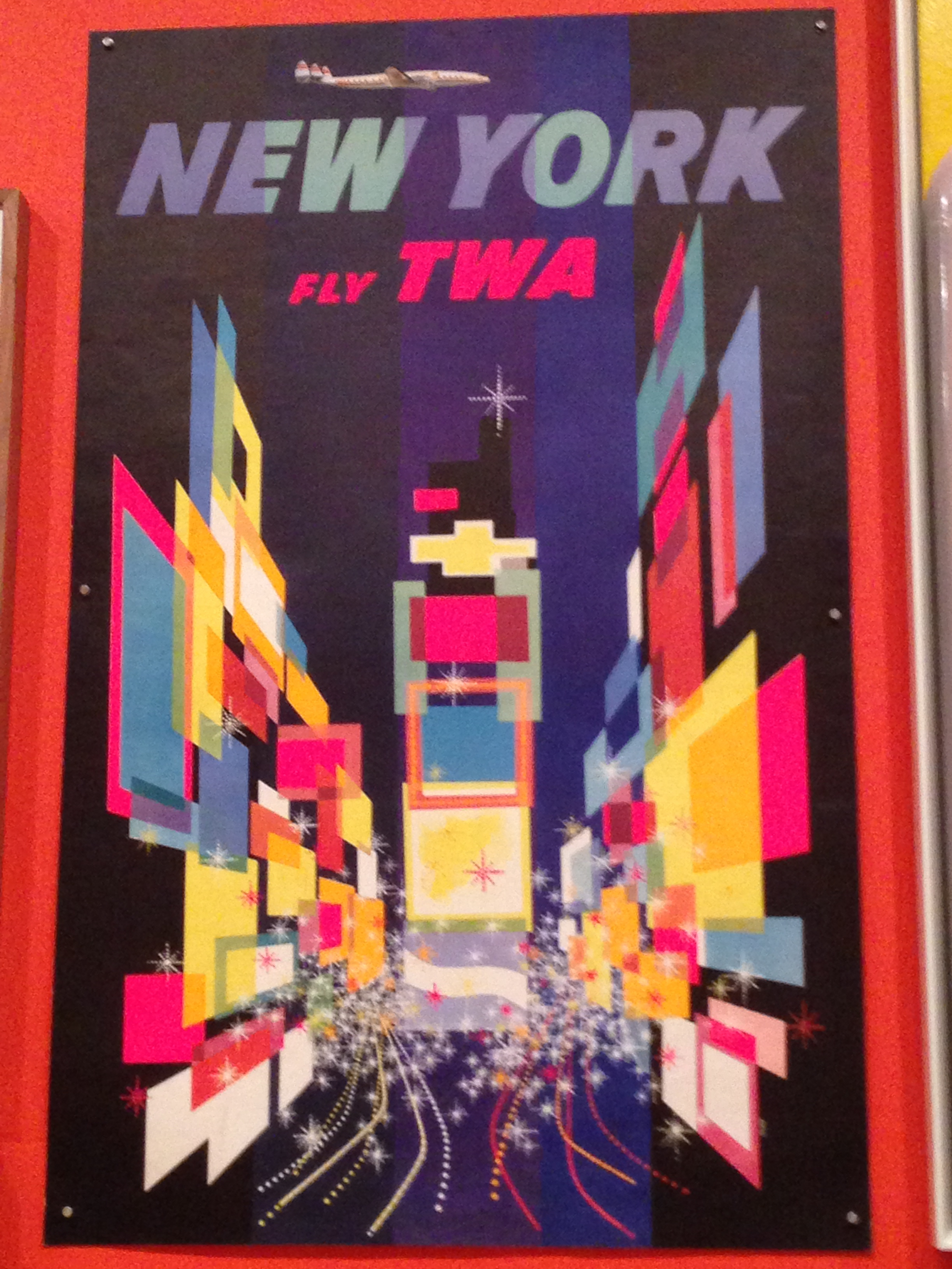
I went to MoMA and spotted this old TWA Poster. I really liked this poster because it used mostly simple geometric shapes to capture the business and flashing lights of Times Square. Using mostly different colored squares, David Klein creates a lot of depth and motion. The rectangles are zooming in towards a horizon point and are layered on top of each other, which gives the effect of rushing towards the central part of the picture. The square shapes in the center can easily be recognized as the central part of Times Square. The dots at the bottom of the poster create lines which kind of resemble speeding cars. This also creates motion as they all are leading to two spots on the poster. The colors Klein uses are neon and bright, which resembles the kind of electric atmosphere and bevy of ads Times Square is famous for.
I also like the New York, Fly TWA typeface at the top of the page. It is slanted slightly so it looks like its moving in the direction of the plane above it, also adding motion which is important for an airline ad.
I thought this poster was a good example because it serves a function in promoting an airline, but was impressively executed using just simple shapes and type.


This piece by E. McKnight Kauffer (currently on display at MoMA) is a visually striking poster from 1930. It advertises London’s Underground Railway through design choices that clearly emphasize a sense of strength, boldness, and excitement. A strong, thick typeface is used, which relates to the physical strength portrayed in the graphic (e.g the muscular arm/hand). The use of red, orange, blue, and black in both the graphic and the type is eye-catching and creates a sense of unity within the design. There is a sense of motion conveyed through the use of the repeated lines, as well as the overall layout of the poster. The placement of the graphics and the type brings the viewer’s eye around the poster in a clear and fluid motion; starting in the upper right hand corner, the eye swerves down the page (curving left, then right, and left again) to finally rest on the word “underground.” By overlapping the graphics and placing them in close proximity to the text (just barely overlapping in places), the artist has given the design an industrial feel, with all components working together as if part of a machine. Finally, my favorite element of this design is the use of the geometric shapes in the graphic (e.g. the large circles and thin, repeating rectangles) which are then mirrored by the lettering of the word “power.” Overall, the design is both interesting and clear, and has a bold, modern style that I find very appealing.

Two groups of posters designed in Japan are on display at the TDC Gallery on West 36th Street in New York: “Move On,” posters designed for the 40th anniversary of the Chubu Creators Club (CCC), and “Hiragana,” posters by eight graphic designers from Nagoya, Japan. The CCC is an association of designers based in Nagoya, a UNESCO City of Design.
The exhibition will be on view to September 26, 2013 and will not travel to any other venues in the US.
I haven’t seen it yet, but I’m going to try this week.
jb